PC:http://www.atsinfosystem.com/wp-content/uploads/2016/06/free-logo-designing-apps-software.jpg
As a key skill for Graphic Designers, it is important that you expertise in Logo Designing. To begin with, here is an example of how you can plan and design a logo. Before you even start about it, let’s first tell you the importance of logo in branding.
Role of Logo in Branding
Always remember that Logo is the premiere identity of a Brand or Organization. So what you do now will last with the company forever, at least most of the times it does. Didn’t you get the point? Alright, now identify the below brand.
PC:https://upload.wikimedia.org/wikipedia/commons/thumb/a/a6/Logo_NIKE.svg/2000px-Logo_NIKE.svg.png
Did the name “Nike” just pop up in your mind? Or at least did visuals of sports shoes and jerseys flash in? Yes, that’s what we are talking about.
The logo is certainly an identity to the company.
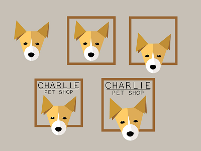
In this blog, we have tried to show you how you can come up with an interesting Combination Mark logo for an imaginary brand, “Charlies Pet Shop”.
Let’s get started…
First, let’s discuss how we are going to create the Logo design. In this logo design, we are going to use a combination of design and text.
The most suitable symbol or character would be a pet, for obvious reasons. Don’t you think? And we zero in on a pup to represent “Charlie’s Pet Shop”.
Now the challenge is drawing a pup? No, not exactly. The challenge here is how the pup is going to be integrated to a logo.
When we choose an animal for a logo, we have to choose between whether we are going to use the full body of the animal or just stick to its face. If it’s the full body, then should it be standing, sitting or jumping? If it is the face, then should it be front view or profile view?
Now let’s stick with the front view of just the face. Now the focus is how to get the face right. This time let’s try doing it with few simple geometrical shapes. Talking about shapes…
A famous Turkish Proverb saying goes like...
Don't look at the shape -- look at the character.
We are going to form a pup using just:
· 2 Squares
· 5 Triangles
· 6 Circles
Don’t be surprised, that’s true! Follow these steps and you will see how it evolves into a logo.
Step 1:
Open an Adobe Illustrator file as the logo should be a vector file and Illustrator gives us exactly that.

PC: http://ferramentasinteligentes.com.br/wp-content/uploads/2016/10/Illustrator.png
Step 2:
Next step is to draw a square. Then, tweak it at the bottom and pull the corners closer. Make it like how it look as in the below image.
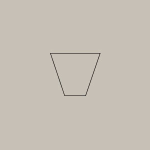
Add a circle to the bottom part, which will eventually become the mouth part of the pup.
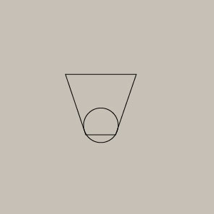
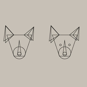
Next is to create the ears. Make an equilateral triangle and then drag a corner to make it like an obtuse triangle. When you’re happy with one of the triangle, make three copies of it and place it at either end of the upper part of the square (see image below).
Place one more elongated isosceles triangle from the center of the circle towards the face to form its nose.
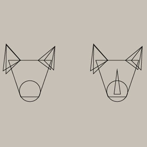
Step 3:
This step is adding details to form the facial features. It all comes in circles. Yes, add two little circles to form the eyes and one slightly bigger circle to form the lower part of the nose (see below image).
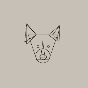
Step 4:
Expand the circle below the nose and tweak it to form the nose button. Next using the Direct Selection tool, adjust the eye to make it look like the eye of an animal.
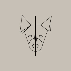
Step 5:
Now that the entire face is done, we need to think of it as a logo. So giving some shade to the image will help us.
For that:
1. Draw a line across the center of the image.
2. Select all.
3. Click Object -->Expand.
4. Click Windows->Pathfinder->Divide.
Now the entire face is divided into two halves.
Step 6:
Add suitable colors to one-half of the face and choose a darker hue to fill the second half of the face. In this case, we have used shades of browns and yellow.
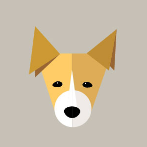
Step 7:
Do you think you’re done? No! You’re only done with one part of the logo. The second and the most important part is here.
Add a box around the face and drag in such a way that it looks as if the pet is peeping out of a window.
The most important are the name. Because this is a ‘Combination Mark’ logo we need to add text along with the image. So we have chosen a Sans Serif font to form the title, ‘Charlies Pet Shop’.
What you have seen so far is just an example to get you started. You can try doing many such and become a Pro Logo Maker. Ultimately making the client happy should be the priority, as it is they who know their audience the best.