A logo is what customers connect with the brand, company or services. Despite the fact that they're commonly little pictures, logos convey a message of significance. A well-designed logo performs as a certifiable presentation of the company; it becomes a symbol for a brand to help customers identify the company.
As logo is an important part in building a brand, to handle such a challenge, considerable strategy, planning and process should go in to designing it. Planning a logo that is both illustrative of the brand and engaging requires a strategic approach. It involves a good understanding of the elements and principles of design.
The word ‘logo’ actually is a Greek word, well, for ‘Word’. In the context of branding, a logo can be in the form of a word-mark (or logotype) or a symbol (monogram) or both. Before you begin to plan for designing a logo, you would have to understand the qualities of an effective logo in order to incorporate them in your work. This blog will help you understand them.
-
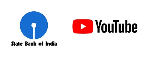
Simple: A good logo design is one which is first of all simple and can be understood at just a glance. The visual engagement with a logo is just for a few seconds, and in that time it has to communicate a message clearly and quickly. A design which is simple would do this effectively. If you’re using symbols, be reductive — eliminate unnecessary details, keep the barest details. In choosing type, pick the one’s that would print without losing details. The logo of State Bank of India (SBI) is a good example. The white in the middle of the blue circle resembles that of a keyhole; and which is a symbol of safety, security and strength. Another example is the logo of YouTube.
-
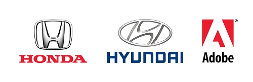
Distinct: While simplicity is the key in logo designs, you have to make the designs distinct to make them unique. A simple logo should also be striking. Many brands have logos which have symbols made out of a single letter, usually the first letter of the name. Automotive brands like Honda and Hyundai have their logos made from the letter ‘H’, yet they are distinct. Software giant Adobe’s symbol is a stylized ‘A’.
-
Versatile: As a brand’s logo would be used in different sizes across different mediums (like paper, corrugated boards, metals, vinyl sheets, store signage, the internet, mobile devices etc.,) it has to be versatile. The logo has to be designed in such a way that when it is scaled down or up it does not lose details. The smallest size logos may be as small as 16 X 16 pixels, like favicons found on the tabs of web pages. And the largest may be used on gas filled balloons. Sometimes a fashion brand’s logo get printed on pockets and tabs of the apparel, and only the logo which is simple lends itself to be embroidered. Versatility would be achieved when symbols are simple, colors are few, and the typography is crisp and clear.

-
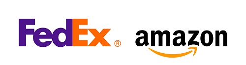
Appropriate: Sometimes logo designing projects present opportunities to showcase the service or product through use of symbols. Take hospitals and pharmacies as examples; when a cross (like a + symbol) is used as a part of the design, it immediately suggests that the place has got something to do with medicine, first aid or health-care. Eateries, juice shops, cafes etc., also give opportunities to design appropriately. The logo of FedEx is a clever way of using the negative space created by closing the gap between the letters ‘E’ and ‘x’ to make it look like an arrow (which would stand for accuracy and speed of delivery). Amazon’s logo, which has a curved arrow pointing out the letters ‘a’ and ‘z’ is another example of appropriateness.
-
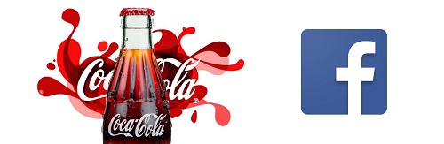
Memorable: As mentioned earlier, a logo is what the public connects with the brand, product or service. And logos that get in to the minds of the target audience in a positive way become memorable. Just as in fashion, graphic designs also go through trends. Keep track of the trend, and stay trendy. Logos of Coca Cola and Nike are best examples of memorable logos. It is claimed that the percentage of world’s population that recognize the Coca Cola logo is a phenomenal 96%! One of the contributing factors to this success is the memorability of its logo. Similarly, Facebook’s logo is also quite memorable, even though all it has is the letter ‘F’ inside a rounded corner square. These logos meet all the criteria mentioned above; they are simple, distinct and versatile.
Some logos, at times, go through an evolutionary process of becoming trendier and better. After almost fifteen years, Google changed its logo from a serif type to a sans serif logotype while retaining the same colors. And the result? A logo that looks trendy even in the smallest size of favicon. So, whether you’re designing a new logo or redesigning an existing one, apply the above qualities and soon your logos would become successful too.